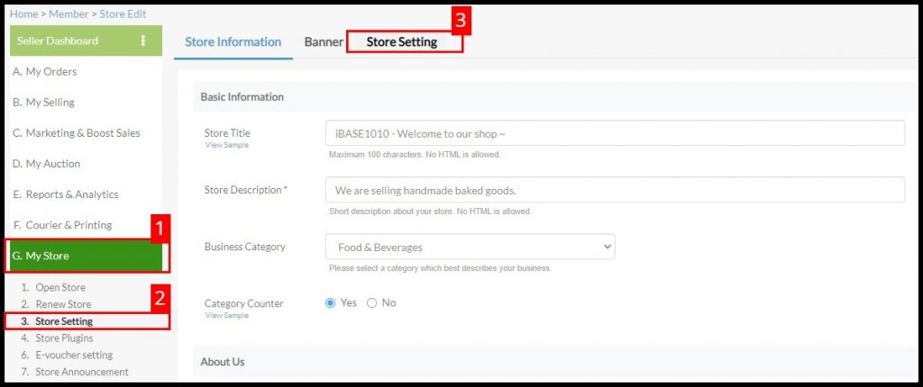
How to access DIY Store Setting ( Mobile Version ) ?
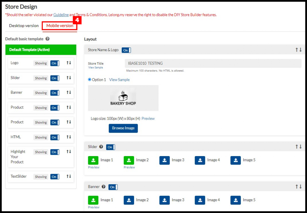
Go to “G. My Store > 3. Store Setting > Store Setting > Mobile Version“.
NEW UPDATE
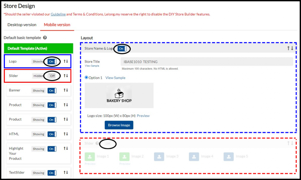
- Enable or disable the template section
At any time, you can display or hide the section.
- To enable section, click “On” and the status will display “Showing”
- To disable section, click “Off” and the status will display “Hidden”
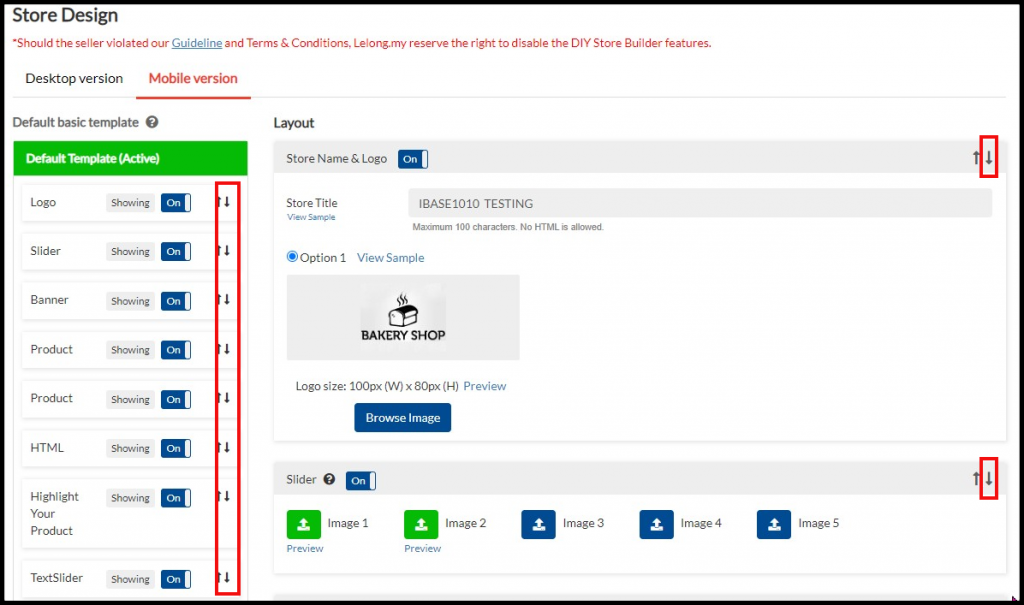
- Move up and down the template section
– Click “↑” to move the section upward.

– Click “↓” to move the section downward.
How to use DIY Store Setting (Mobile Version) ?
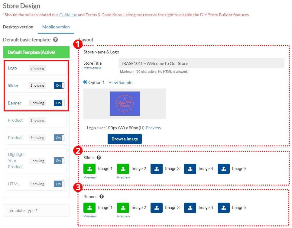
1. Logo
Recommended image dimension :
- Maximum dimension: 100px X 80px (width x height).
2. Slider – Allows you to upload up to a maximum of five (5) banners under this section.
- Image dimension is 1200px X 400px (width x height).
- Image uploaded must be in JPG format and less than 500kb in size.
- You may link the banner to your store category or a specific product.
3. Banner (Static) – This area allows you to upload up to a maximum of five (5) banners.
- Image dimension is 1200px X 400px (width x height).
- Image uploaded must be in JPG format and less than 500kb in size.
- You may link the banner to your store category or a specific product.
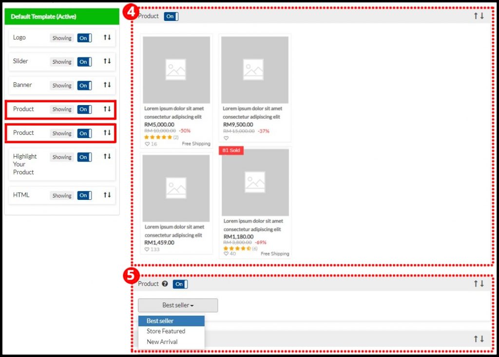
4. Product
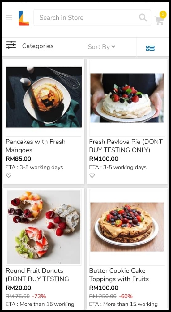
Display default product listings (for all products).
5. Product
Highlight your products from the system default template:
- Best Seller
- Store Featured
- New Arrival
6. Highlight Your Product
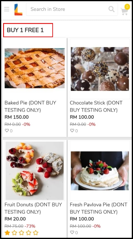
Create your own product section to highlight your star products.
- Example Section Title. Eg: Buy 1 Free 1, Promotion Item
- Maximum five (5) product section can be created.
- Each product section only can feature up to a thirty (30) products.
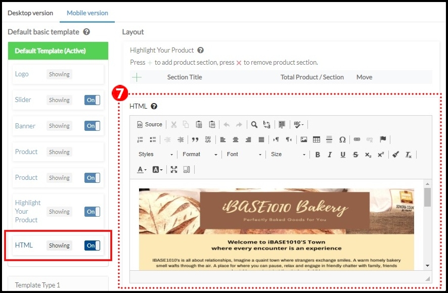
7. HTML
This area allows you to upload HTML codes based on your preference. You will be able to insert banners or even embed videos into this area.
- Upload your image(s) or video(s) to hosting service provider. For example:
- Image:https://imgbb.com/,
- Video: https://www.youtube.com/
- Javascript, CSS and etc is not allowed.
- Banner(s) are not allowed linked out to external party.
- Maximum width is 1200px.
Remarks:
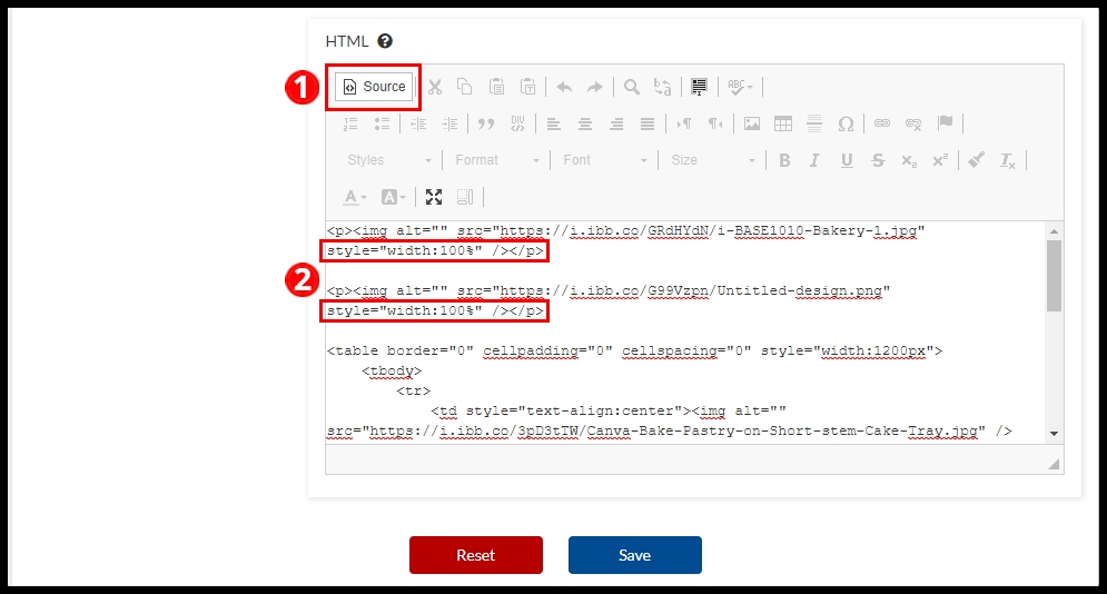
Please add “style=”width:100%” for every image in your html code. For example:

To add this setting, firstly click button “Source”, and add “style=”width:100%” in every image html code.
Example image with responsive phone size (“style=”width:100%”):
Example image without responsive phone size (“style=”width:100%”):
** You may also enable or disable the section from the left menu based on your preference.
8. Text Slider
- Maximum five (5) slider section can be created.
- 4 animation style : Fade, Slide, Cube Coverflow

- Click
 to add new text slider.
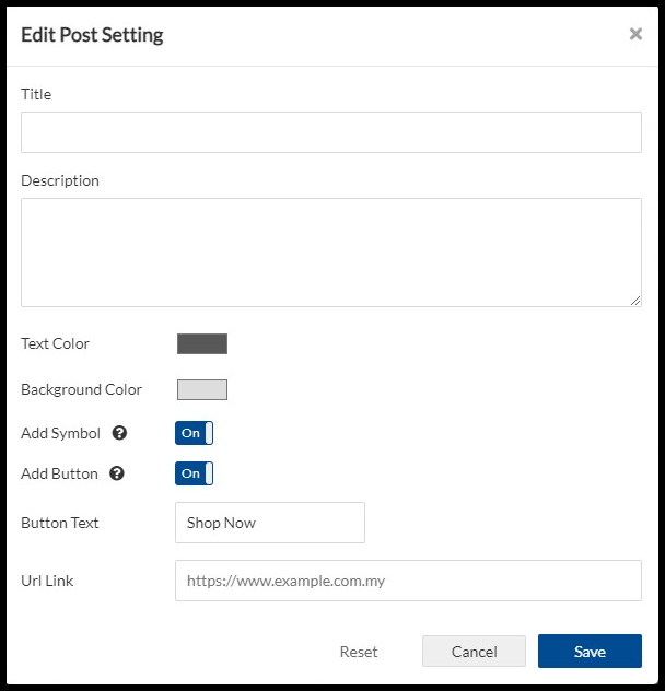
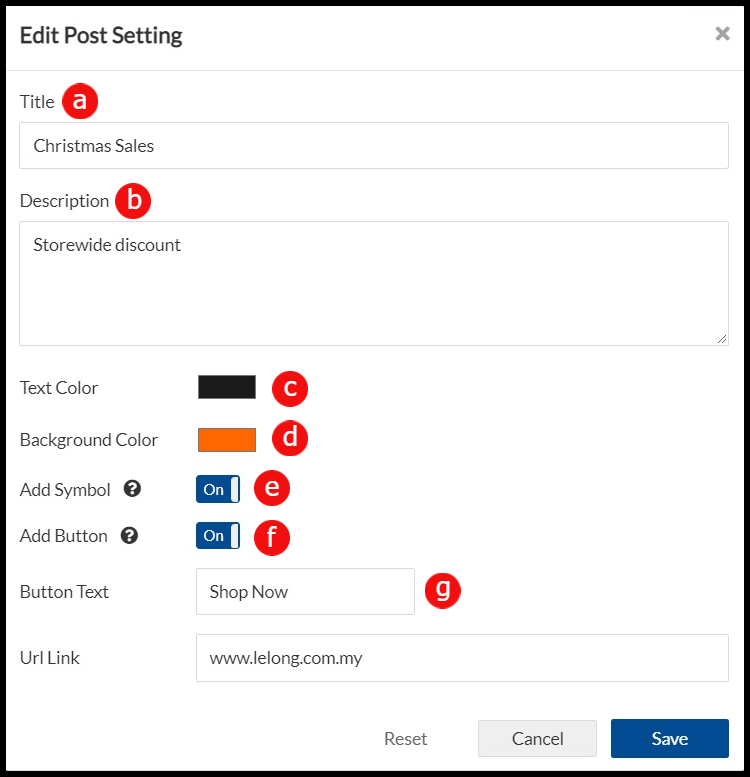
 - In Edit Post Setting Page, enter Title and Description.
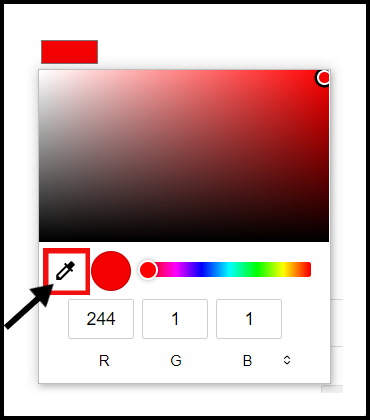
- To select Text Color and Background Color:
- Select the Eyedropper.
- Point at the color you want to apply, and then click. The color is immediately applied to the slide background.
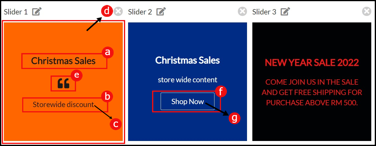
- To enable Add Symbol and Add Button section, click “On” and the symbol and button will display “Showing”. To disable these section, click “Off”.
- Enter a Button Text.
- Enter URL Link.
- Click Save once confirmed with the setting.
For example:
 | |
 |
In mobile web, the text slider located bottom of the page as per below:
